I know I’ve been absent for a while. Without a lot of boring detail, life got hectic for a while, with three separate crises, two of them life-threatening. Things are almost back to normal, so here I am. While I was pretty much homebound, I bought a whole bunch of darling digital stamps, and could hardly wait until I could begin to color for fun again. Here is one of the first ones I just completed. His name is Bigsby, and he was drawn by Karen Johnson, of http://www.karensdoodles.com. Isn’t he just adorable? Both Bigsby and the palm tree are from a digital set called “Tropical Party Set”, resized and printed on Neenah Classic Crest Solar White card stock, and colored with Copic Markers. Greeting is computer generated. I’d love to see your comments. Happy stamping!
Latest Entries »
 Hi Fellow Stampers! I wanted to share this scene with you and tell you how I did it. The figures at the bottom are a digital stamp by Elizabeth Bell, and it’s “mixed” with a landscape scene that is primarily Stampscapes. The original is 8″ x 10″ and was really fun to do, but it took several hours. It is colored with a mixture of copic markers and dye inks using a colorbox stylus with a sponge on the end. Here’s how I did it.
First, I stamped the major portions of the scene on a piece of plain copy paper to get placement and determine where to put the digital stamp. Here is a reduced copy of that worksheet. If you click on the image, you can view a larger version.
The bridge on the upper left of the scene is by A Stamp In the Hand, the bushes in the upper left is a small foliage stamp by Art Impressions, and all the rest of the stamps can be found at http://www.stampscapes.com.
Starting with a clean sheet of Neenah Classic Crest, I then printed the digital image at the bottom, roughly in the spot where the hand drawn rectangle is. Then using the worksheet as a guide, I built the scene around the figures. The “blanket” is handrawn with a pencil. I colored the blanket with B21, and made the plaid by using a newly filled colorless blender, and drawing vertical and horizontal stripes with the larger tip of the blender pen. I didn’t outline the edges with a black sharpie extra fine pen until I had completed the scene, because I was afraid it might bleed with my copic markers.
The sky and clouds were sponged in shades of blue and pink dye ink using a torn paper towel to create cloud shapes. I also sponged in some very pale green in part of the grassy areas. Then I got out my copics and colored everything else. I decided that I needed a bush in the middle ground in the approximate center, and created it with the small foliage stamp done repeatedly. Here is where I almost ruined my whole scene. I stamped it too many times, and it looked like a big blob of black. Oh No! By this time I had put hours into it. So I stamped the bush again on a separate piece of card stock, colored it, cut it out and tried pasting it on top of the scene. Here’s what that looked like:
Well, the color’s better, but it still sticks out like a sore thumb. I was devastated. All that happened yesterday, so I put it away, determined to figure out how to salvage my scene. This morning when I got up I had the fix! I removed the pasted on bush, used household bleach and a paint brush and bleached out the over-colored image . Then I re-stamped and colored it as it appears in the final scene. I was pretty happy with the result. The last thing I did was color the digital image and add the birds in the sky. I used many colors of copics on the scene, so won’t try to list them all; but the yellows on the focal image are Y13, Y15, & Y17. The browns in the pants and hair are E29, E25, and E53. I used mainly G40, G24, G82, YG23 and YG03 on the foliage, B21 for the water, and E11 and E00 on the skin. I hope you like it, and I’d love to hear your comments. Until next time, Happy Stamping!
This is a scene I did for a swap at the StampscapesII yahoo group. My swap partner, who lives in The Netherlands, has received the original so now I can post it. The scene had to have a church somewhere in it, and use stampscapes.com stamps, but they could be mixed with other stamps. I got the idea for this from a friend named Pat Moore, who did a scene where this cute little mouse was painting a barn red. I still have to CASE that one, it was sooooo cute. This original scene is 5″ x 7″, but I reduced it to save loading time here. I used a mixture of Copic markers and adirondack dye inks to color the scene, and it is stamped in Memento Tuxedo Black dye ink on Cryogen paper. I’d love to hear what you think of it. Until next time, Happy Stamping!
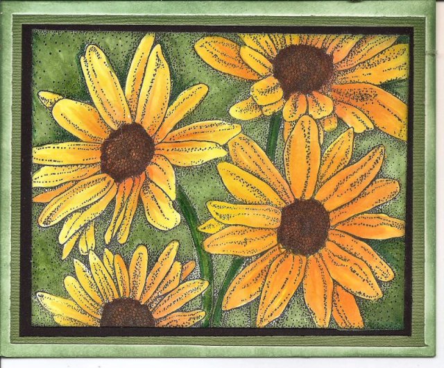
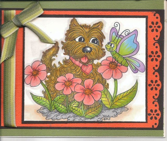
Hi Fellow Stampers! I’ve been missing in action a few days because my computer died. Literally just up and died. Fortunately, it turns out it was only the power source that went out and I got it replaced for $100. Seems my machine was so full of cat and dog hair, it killed it. Now I know how to take off the back of the computer and clean the inside. It’s also running a whole lot quieter now, who knew? Anyway, while I didn’t have my computer I had lots of time to color, so here are two more cards I made with my copics. I was practicing on “yellows”, “flowers” and “fuzzy little dogs”. I’d love to hear what you think of them. Until next time, happy stamping.
Look at the picture before you read my comments. You will see why when you read them.

All stamps by http://www.stampscapes.com
.
This is a scene I did several months ago when I was trying out some new techniques in composing and coloring scenes with inks. When I posted it on the yahoo stampscapesII group, it was pointed out to me that the perspective wasn’t quite right. It has to do with the sizes of the deer in the foreground and the walking people. Their relative size makes the people appear to be about 10 feet tall. I didn’t see it until one of my friends on the group, a more experienced artist mentioned it. Did you notice it?
I really liked the composition, so I redid it several times, fixing the perspective each time. However, none of the newer scenes really captured the wintry, snowy, feeling of the first one. Bummer!
Kevin Nakagawa, owner and creator of http://www.stampscapes.com saw several of the scenes, and liked this one the best, flawed as it was. Through the magic of computer technology he “erased” the deer, and turned my scene into an idea card which he sends out occasionally with retail and wholesale orders. You can see the idea card at http://www.stampscapes.com in my gallery. Isn’t technology wonderful?
Thanks for stopping by. I’d love to hear your comments. Until next time, happy stamping!
Both of the cards above were made for a flower challenge on Suzanne Dean’s Color Me Creative Website. They are both from Peddler’s Pack, my favorite maker of background stamps, and both are colored with copic markers. The first one uses only six colors, R29, R24, R22, R20, G28 and G40. The second one uses more colors, and unfortunately I didn’t write them all down. What is different about the second card is that after it was colored, I added two coats of clear embossing ink and powder to make it really glossy. I The Peddler’s Pack gallery had a sample of this technique done on a different stamp with a different coloring medium, so I thought I would try it. I really like the look IRL. Thanks for stopping by, and as always, your comments are welcome and appreciated.
There is a story behind this little digital cutie by Elisabeth Bell. When I wa coloring the image with copic alcohol markers, I went outside the lines pretty significantly on the upper part of her right arm…. in RED! Ugh! I tried and tried to push the red back into her jacket with the blender pen, but I ended up with a horrible mess. And of course, I did that at the very ending of the coloring. Not one to give up, or waste all that time I was coloring her, I cut her out. But you see all those little strands of hair? I cut off one of them by mistake. Not daunted, I then copied another image the same size, and colored only her hands, her legs and feet, and the hair strands that stick out from her body. Then I sponged the background in green and grounded that image with two shades of brown. Next I finished cutting out the original image, cutting off all but one of the strands of hair, and her legs and feet. I popped her up with dimensional tape, and voila, image saved.
That’s not the end of the story, though. While I was trimming the background image I didn’t notice that I had cut it crooked, and it was so close to the top of her head I couldn’t straighten it up without cutting off part of hair. By now I had invested a lot of time and it looked like I was going to have to toss her. I remembered seeing some gorgeous cards where the focal image was added asymmetrically, so I figured, what the heck. Nothing ventured, nothing gained. This is what I ended up with, and I bet if I didn’t tell you it was cut crooked, you wouldn’t see it. How’s that for a save?
This card was made for a challenge on Suzanne Dean’s Color Me Creative website. The challenge was to use shade of blue and/or aqua AND to color water. The stamps are all by http://www.stampscapes.com, and the composition is one originally created by Sandy Hulsart, a friend of mine, for her online class at My Creative Classroom. I took that class, which is where I first saw this composition. The image is stamped in Memento Tuxedo Black Dye Ink except for the clouds and moon which are stamped in Adirondack Denim Dye Ink. After stamping I colored the entire image with Copic Alcohol Markers. I used a lot of colors: B0000, B000, B00, B02, B06, B12, B16, B21, B29, and BG10. I used a Sharpie Extra Fine Point White Poster Paint Pen to add some highlights to the water, rocks, and grass. Now that it’s complete, I can see that I should have left some white space, both in the sky and in the water to create more highlights. I guess you live and learn.
Hi, fellow stamping brothers and sisters.
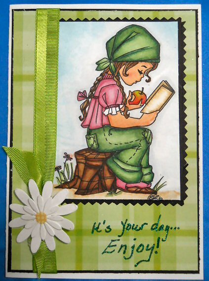
Well, I guess I’m finally ready to go public with my new blog. I’ve been working on this for a while, and I have a lot to learn, so be gentle with me. I’ll be learning as I go along, and I will figure out about blinkies, and widgets, and all the other things that are like a foreign language to me. Today, I’d like to introduce a card I just completed using a gorgeous Elisabeth Bell digital stamp. The stamp is called “A tasty read”. I used a very simple presentation in order to focus on the image. I used background papers, ribbon, and a flower from my stash. The sentiment is handwritten with a glue pen and then glittered. The image is entirely colored with copic markers. I hope you like it Please leave a comment and let me know what you think. Thanks for stopping by.

Stamp Credit: http://www.karensdoodles.com (Apple Harvest)
This is my second post, and I’m still learning how to format; if anybody stumbles on this site. The card above was made using a beautiful digital image called Apple Harvest. I found it at http://www.karensdoodles.com. Isn’t she adorable? I wish I had written down all the colors I used; but there were a bunch, and I was experimenting. I will try to get better about that. All the background leaves are rub-ons. I used a Martha Stewart punch, and some nestabilities. Let me know what you think.


